Hello and welcome to Part 1 of my Ombre Odyssey! Ombre is an effect that has been making appearances in home decor, hair and beauty, and of course papercrafts. Ombre means graduated shades of colour and with the Stampin’ Up! families of colours it is just a perfect effect to achieve and can be done in a variety of ways. Over the next few days, I’ll share a few projects to showcase how you can have a go at this effect.
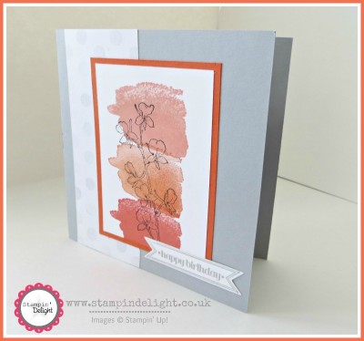
Today’s card shows how I went for ombre with my inks collection, so come take a look:
STAMPIN DELIGHT TIPS & TRICKS
- The ombre effect was created by using 3 shades of orange graduating in depths of colour, starting with Crisp Canteloupe, followed by Tangerine Tango, and finally the darkest is Calypso Coral.
- The “splodge” stamp from Happy Watercolour stamp set is perfect for this style. To create an ombre effect it is best to repeat the image in the varying shades.
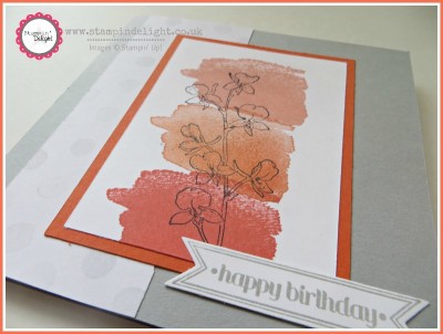
- This effect is the perfect home for a beautiful outline image like his flower stem from Happy Watercolour stamp set. I used Stazon Jet Black for this to ensure it didn’t smudge and left a crisp permanent image.
- The base of the card is a 5″ x 1o” piece of Smoky Slate cardstock which coordinates with the strip of Watercolour Wonder Designer Series paper.
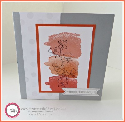
- The card was finished off with one of the cute sentiments from Itty Bitty Banners, which is simply die cut with the Bitty Banner Framelits.
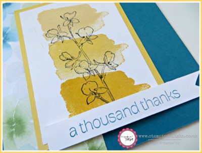
- I also created it in alternative colourway – here the ombre effect is created with the following trio of yellow inks – So Saffron, Daffodil Delight and Crushed Curry.
So I’ll be back with more ombre inspired designs for you soon, but in the meantime why not see what trio of inks you have you could play with to create this technique. I would love to see your projects so why feel free to email me a link or post them on my Facebook page.
Hasta luego / see you later
Louise
Stampin’ Up Supplies List – Click on the images below for more product details and easy on-line shopping!


0 Comments